INTERVIEW: SUE HAVENS + Bradley Rubenstein

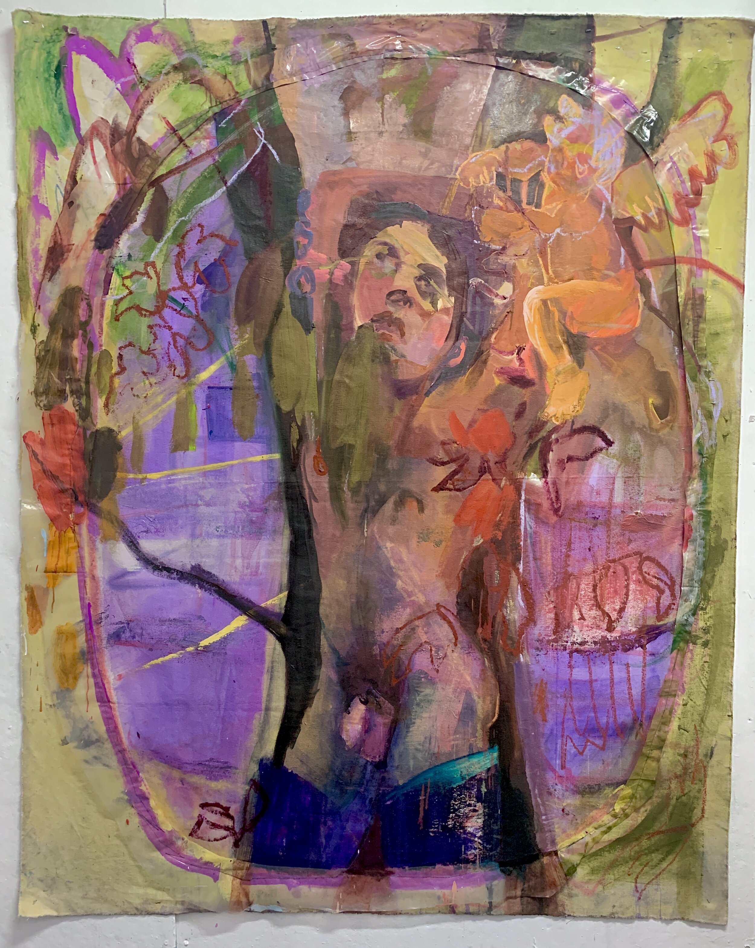
Bradley Rubenstein: There is really so much going on in your paintings, both visually and conceptually, that I kind of want to take those apart for a minute. The work you had up at Park Place Gallery in Brooklyn last spring, with the sculpture and large drawing for the Knockdown Center sort of took the focus off those—they really bear careful looking. First there are a lot of references to other art in them, like Johns and Lasker, Dubuffet…that is just me reading into them. But you are playing a kind of High Art/Low Art game too, with the faux finishing, tromp l’oiel, marbling and whatnot…
Sue Havens: Yes. As you recognized, my versions of faux finishing and tromp l’oiel are in a sense borrowing from less “skilled” or Low version of what they might be. They are a kind of response to “perfect” kitsch painting approach – one that I absorbed working 12 years at the Danbury Mint painting prototypes and painting figures at the Wax Museum. This kitsch indoctrination (and my inclination towards precision) was something I had to break down. Seeing things like hand painted auto mechanic signage in Queens was a major influence. I’d see these amazing paintings on garages of carbeurators which I used as models of how I wanted to paint. The paintings were clunky, off, funny/wrong, vivid, bold, all in all, exactly how I wanted to paint. I was influenced by a lot of things like hand painted movie posters in Ghana-there was this amazing show at Mass Moca called Extreme Canvas a few years back….The movie posters had this incredible sensibility- kind of rough-hewn, volumetric, figurative images of horror but also managed to be funny at the same time. This reminds of the phenomenon of uncontrollable (and inappropriate) laughing at a funeral. Like the humor is the mirror to the dark side(pathos) : the outlet/release.
BR: You talked a bit about the handmade nature of your work, the desire to make “actual” objects in an increasingly virtual visual landscape. I see a lot of connection between the ceramic pieces and the paintings…
SH: I am a maker and have been for as long as I can remember. I remember my life so much in terms of what I was making at the time. The virtual visual landscape (even TV) wasn’t a part of my life until relatively recently. Living in New York I always had something brewing. When I moved down to Tampa for a teaching gig at the University of South Florida in 2015, I found amazing facilities and studio space for the first time since being at Cooper in undergrad. So that naturally led to a real change in scope and scale of the work. Ceramics is new to me, but made such sense to work with. Maybe not without coincidence, this happened working alongside my son and his Playdough. Things have a way of working themselves in, for sure.
In ways New York was a really hard place to live. It had it’s magic, and you get totally used to living with the inconveniences – but daily life is compromised in all kinds of ways. Energy is sapped by basic life challenges. Time is eaten up by transportation, etc. I feel really fortunate to have found a place to live where I am connected to the city but have space, fresh air, plants, birds, etc. My new job is really busy, but ties in really well with what I do as an artist. Having conversations with students about what they are making and Art makes so much sense after a life of practicing it.
BR: There were a couple pieces that I thought really gave three-dimensionality to a lot of the visual ideas of the paintings. In one you had a white and gray amphora that reminded me of Rococo period cubism, where Picasso took the dots and slashes of newsprint, or colored spots from wallpapers and applied those ideas to the absinthe glasses…
SH: In a most recent piece (The blue piece I sent you) I worked directly with an idiosyncratic standout part in a painting. I wasn’t sure how to go about it, but knew that the object need to act as the shape in the painting did. And if I achieved it in context with the paintings, it would give the installation a sense of back and forth between 2D and 3D that I am interested in.
BR: Staying with the ceramic constructions a bit more, there is also a weird playfulness to them, for some reason I kept thinking about Robert Arneson’s work, not in the figurativeness that he has, but that he was doing things in clay, that most ancient of mediums, that was contemporary.
SH: Yeah I loved how working with clay, forms took on a literal weight but also carried with it a deep historical sense of things that spanned time from the past. I had a sense of clay forms from history, but my building comes from a trajectory of non-clay forms-- sewn forms, built paper constructions, and shaped and two-dimensional painting. The fired clay form felt massive and timeless. I started wearing down edges with tools and imagine the rocks in Cypress worn over time-rounded corners. Or the spectacular worn columns at the ruins in Ephesus near where my husband’s family lives in Turkey. I am trying to bury the language that I have developed over time -- the color, the form, the pattern specificity, within each object— beneath layers and seal into the form through firing the clay and glazes. But all the while I am thinking of them still as shaped paintings. Painted form. Sculpture. Paintings.
BR: You were working on these large-scale cut-out, drawn, collaged pieces that were studies or maquettes for the Knockdown Center…
SH: I made the large paper collages, and then had the idea to make a mural based on them after an invitation from The Knockdown Center for their FiftyTwo Ft mural series. With the large paper collaged paintings, the process was really immediate and fast, when compared to working on canvas. I’d start off with these huge 40 foot rolls and paint color areas, scale up the line, and drag paint with particular brushes-this was all stuff taken over time from responding to things that I picked up on around me. I can trace it back to 1995 when I was making these shaped fabric organ-like piles filled with rice out of striped T-shirt scraps. Those palettes and patterns worked their way into my work over time. I ended up writing a craft book with RandomHouse and the same collections of palettes found their way in.
With the large 40 foot rolls I’d gradually and liberally cut up the paintings on paper, paint edges, work on the floor, and build back up into something that had visual weight both in terms of complexity, density, and scale. All of the parts had to work as a whole for it to work. Very much playing off a grid but allowing for a dance to happen around it. In the end the thing had to be something that is a felt and surrounding, cohesive presence in terms of how it emits form, color, line, etc. And on a whole these new large works have a specific and felt color “world”. I have a ear for music and language and I don’t think that color, line, and palette are disconnected from notions of sounds. I often think of the whole operation as orchestral—bringing up dynamics, tone, “quiet” color, “loud” color…syncopation, dynamics – it brings me back to days in bands, orchestras, etc.
These paper works were pretty radical for me because they allowed a break from small scale (drawing done in my small apartment in NYC) with their control and precision.
BR: There is something that reminds me of John's
in your work-
SH: After you’d mentioned that-I found this, it made sense:
In the 1970s and ’80s his paintings, prints, and sculptures became increasingly decorative, but remained challenging. Subtle shifts in the patterning of crosshatched red, yellow, and blue stripes were found in deceptively simple paintings. Prints incorporated recognizable optical illusions. His sculptures have long challenged the division between flatness and relief as well as what is visual and what are mental leaps on the part of the viewer, who must fill certain perceptual or conceptual gaps.
I love this idea of gaps between – 2D to 3D has been something I’ve been exploring since I made my first paintings. They looked like (deceptively) simple box-like supermarket packages. I was trying to make something that had a strong, specific presence while also being spare, and conflating flat painting with shaped painting. This back and forth has gone on since 2000. Reckoning with the EDGE, the frame, the side of a thing. What happens when a flat painting goes around the edge? It becomes more of a thing, and less of a picture. And it’s the felt presence of this object that resonates in us the way we understand dimensional form.
The play between the large paintings and sculpture is what allows for connection and filling in gaps. A good friend said this was poetry. The sculpture reiterates something described in a painting but in ACTUAL terms. In fact, it was painting that I’d made around 2006 that predated my sculptural ceramics. They seemed to describe something that was to happen now. I love the mystery of it all, the suprises --I follow this path and it’s endlessly interesting and full of challenges and impossibilities.
BR: Can you give me a preview of what you are planning for the show
in August?
SH: My idea is to scale up each segment and have each be (roughly) 2-4 feet. I’ll start with gallons of a specific palette- but other than that, I’m going to wing it and mix colors-with scaled up brushes and a lot of paint. I’ll have to make large brushes (out of some crappy brushes) to get a good drag. I’ve never done a wall painting, so I’m looking forward to what it will look/feel like on a scale like that- no only to make it but to be in the presence of something that size. I’m often looking at the lines in the parking lot, the wear on those bright blue and white lines that are painted over speckled grey pavement; that’s what I want to emulate both in my mural and my ceramics. I’m thinking about parking lot scale of brush width and line, maybe slightly smaller. In a recent piece I’m also thinking about the Wonder bread cement truck and it’s dots. One of the greatest things out there….I love the kind of banality and utilitarian aspect of the truck making it’s necessary cement with the spectacle of those rotating dots!